Johnston feeling young again as Hawks rip through WHL foes
On Saturday, Mike Johnston will celebrate a birthday — the Big Six-Five — when the Winterhawks play host to Seattle at Memorial Coliseum.
Looking at the Winterhawks Heading into 2021-22: A new logo and uniforms, Plus plenty of Other Changes
Change is inevitable and, oftentimes, beneficial to a sports franchise.
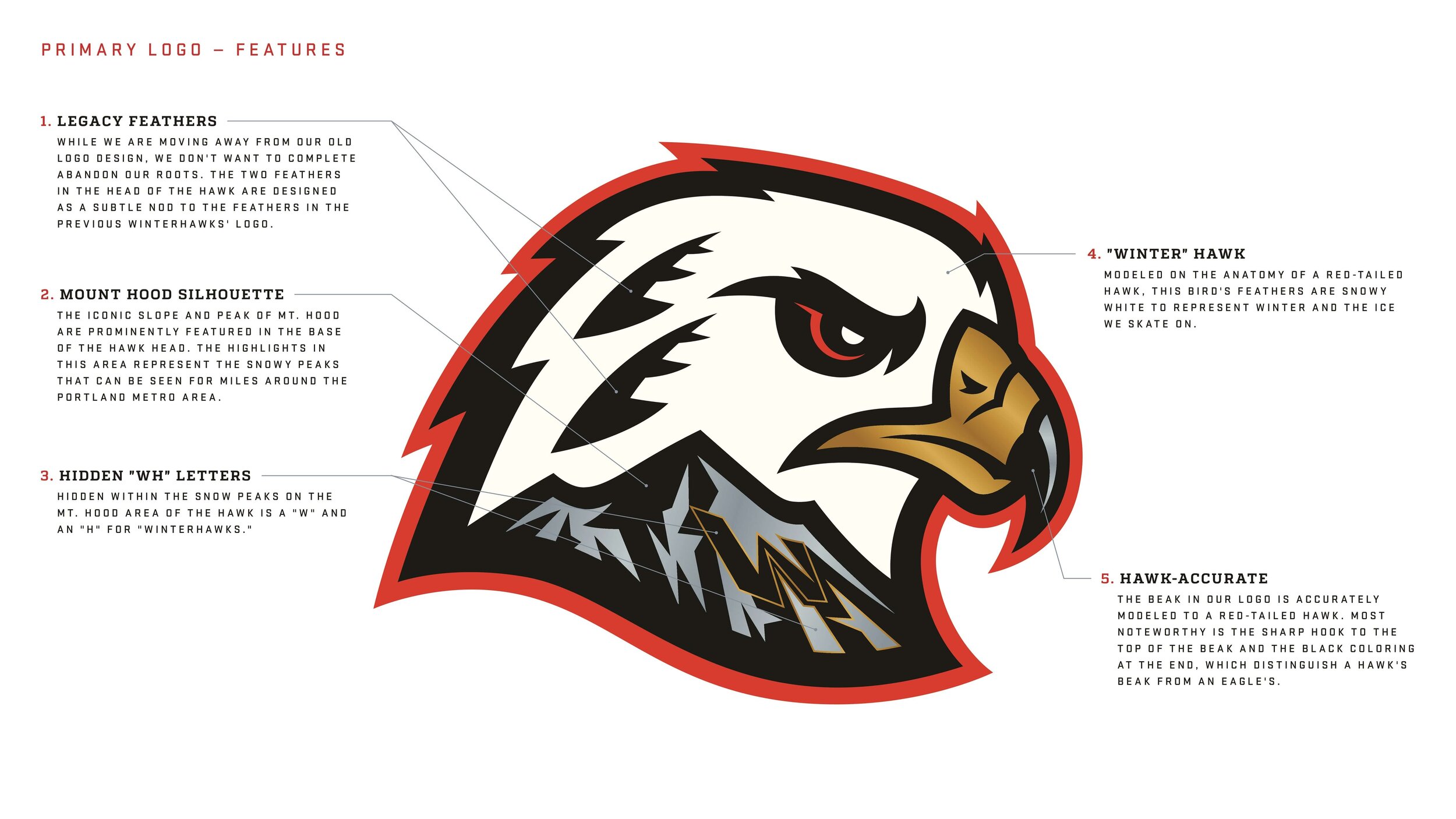
After 45 years, it was time for the Winterhawks to freshen up their logo and, in corporate speak, create a new “brand identity.”
Political correctness provided a push for Portland’s major junior hockey club to move away from its Native American-based logo — borrowed from the NHL Chicago Blackhawks when it moved to the City of Roses in 1976 — to an approach based on the “hawk” part of the team’s nickname.